This time I have collected some useful CSS3 techniques for my readers. These are handy and ready to use techniques that can help you during your website development. I have selected the best tricks out of various excellent articles written by renowned authors. Here is the collection:
1. Multiple background images:
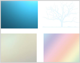
CSS3 allows you to have multiple background images in your containers. Now you need not to implement nested containers with clumsy CSS to create the layered effects.
2. Multiple border colors (FireFox only):
Using CSS3 you can also implement multiple colors in the borders of you containers. Take a look at this.
3. Rainbow Effect:
4. Drop Shadows:
Creating text shadows is now few words far. CSS3 provides direct implementation for text shadows.
5. Rotation:
Now rotate your containers around the axes using CSS3.
6. Box Shadow:
Giving a shadow to your box provides it an elevated effect.
7. Stylish image less buttons:
Courtesy:http://inspectelement.com/
8. CSS3 Columns:
Now arrange your content in multiple columns without those tricky CSS tricks.
9 CSS3 Opacity:
Creating opacity simplified with CSS3.
10. Gradient Background:
1. Multiple background images:
CSS3 allows you to have multiple background images in your containers. Now you need not to implement nested containers with clumsy CSS to create the layered effects.
#multipleBGDiv{
 border: 5px solid #cccccc;
 background:url(bg1.jpeg) top left no-repeat, url(bg2.jpeg) bottom left no-repeat, url(bg3.jpeg) bottom right no-repeat, url(bg4.jpeg) top right no-repeat;
 padding: 15px 25px;
 height: 400px;
 width: 500px;
}
2. Multiple border colors (FireFox only):
Using CSS3 you can also implement multiple colors in the borders of you containers. Take a look at this.
.borderColor{
 border: 8px solid #000;
 -moz-border-bottom-colors: #033 #039 #777 #888 #999 #aaa #bbb #ccc;
 -moz-border-top-colors:    #033 #039 #777 #888 #999 #aaa #bbb #ccc;
 -moz-border-left-colors:   #033 #039 #777 #888 #999 #aaa #bbb #ccc;
 -moz-border-right-colors:  #033 #039 #777 #888 #999 #aaa #bbb #ccc;
 width:400px;
}
3. Rainbow Effect:
.rainbow  {
 /* fallback */
 background-color:#063053;
 /* chrome 2+, safari 4+; multiple color stops */
 background-image:-webkit-gradient(linear,left bottom,left top,color-stop(0.20,red),color-stop(0.40,green), color-stop(0.6,blue), color-stop(0.8,purple), color-stop(1,orange));
 /* chrome 10+, safari 5.1+ */
 background-image:-webkit-linear-gradient(,green,blue,purple,orange);
 /* firefox; multiple color stops */
 background-image:-moz-linear-gradient(top,red,green,blue,purple,orange);
 /* ie10 */
 background-image: -ms-linear-gradient(red,green,blue,purple,orange);
 /* opera 11.1 */
 background-image: -o-linear-gradient(red,green,blue,purple,orange);
 /* The "standard" */
 background-image: linear-gradient(red,green,blue,purple,orange);
}
4. Drop Shadows:
Creating text shadows is now few words far. CSS3 provides direct implementation for text shadows.
.shadow{
 text-shadow: 2px 2px 2px #000;
}
The first two numbers control the offset, which is 2px down and 2px right. The last number sets the shadow spread. If you want shadows above the text, just use negative numbers. 5. Rotation:
Now rotate your containers around the axes using CSS3.
.rotate30deg{
 transform:rotate(30deg);
 -ms-transform:rotate(30deg); /* IE 9 */
 -moz-transform:rotate(30deg); /* Firefox */
 -webkit-transform:rotate(30deg); /* Safari and Chrome */
 -o-transform:rotate(30deg); /* Opera */
 background-color:#063053;
 border:2px solid #e9e9e9;
 height:300px;
 width:300px;
 border-radius:15px;
 margin:50px;
}
6. Box Shadow:
Giving a shadow to your box provides it an elevated effect.
.boxShadow
{
 box-shadow: 10px 10px 5px #888888;
 -webkit-box-shadow: 10px 10px 5px #888888; /* Safari */
}
7. Stylish image less buttons:
Courtesy:http://inspectelement.com/
.button {
    -webkit-box-shadow: inset 0px -3px 1px rgba(0, 0, 0, 0.45), 0px 2px 2px rgba(0, 0, 0, 0.25);
    -moz-box-shadow: inset 0px -3px 1px rgba(0, 0, 0, 0.45), 0px 2px 2px rgba(0, 0, 0, 0.25);
    box-shadow: inset 0px -3px 1px rgba(0, 0, 0, 0.45), 0px 2px 2px rgba(0, 0, 0, 0.25);
    -webkit-border-radius: 3px;
    -moz-border-radius: 3px;
    border-radius: 3px;
    text-shadow: 1px 1px 0px rgba(0, 0, 0, 0.5);
 background: #67b600;
    padding: 10px;
    text-decoration: none;
    text-shadow: 1px 1px 0 rgba(0, 0, 0, 0.5);
 color:#fff;
}
.button.gradient {
 background-image: -webkit-gradient(
  linear,
  left bottom,
  left top,
  color-stop(0.1, rgba(0,0,0,0.3)),
  color-stop(1, rgba(255,255,255,0.2))
 );
 background-image: -moz-linear-gradient(
  center bottom,
  rgba(0,0,0,0.3) 1%,
  rgba(255,255,255,0.2) 100%
 );
 background-image: gradient(
  center bottom,
  rgba(0,0,0,0.3) 1%,
  rgba(255,255,255,0.2) 100%
 );
}

.button.gradient:hover {
 background-image: -webkit-gradient(
  linear,
  left bottom,
  left top,
  color-stop(0.1, rgba(0,0,0,0.45)),
  color-stop(1, rgba(255,255,255,0.3))
 );
 background-image: -moz-linear-gradient(
  center bottom,
  rgba(0,0,0,0.45) 1%,
  rgba(255,255,255,0.3) 100%
 );
 background-image: gradient(
  center bottom,
  rgba(0,0,0,0.45) 1%,
  rgba(255,255,255,0.3) 100%
 );
}
.button:active { position: relative; top: 3px;
    -webkit-box-shadow: inset 0px -3px 1px rgba(255, 255, 255, 1), inset 0 0px 3px rgba(0, 0, 0, 0.9);
    -moz-box-shadow: inset 0px -3px 1px rgba(255, 255, 255, 1), inset 0 0px 3px rgba(0, 0, 0, 0.9);
    box-shadow: inset 0px -3px 1px rgba(255, 255, 255, 1), inset 0 0px 3px rgba(0, 0, 0, 0.9);
}
.button:active:after { content: ""; width: 100%; height: 3px; background: #fff; position: absolute; bottom: -1px; left: 0; }
8. CSS3 Columns:
Now arrange your content in multiple columns without those tricky CSS tricks.
.3column{
 text-align: justify;
 -moz-column-count: 3;
 -moz-column-gap: 1.5em;
 -moz-column-rule: 1px solid #c4c8cc;
 -webkit-column-count: 3;
 -webkit-column-gap: 1.5em;
 -webkit-column-rule: 1px solid #c4c8cc;
}
9 CSS3 Opacity:
Creating opacity simplified with CSS3.
.opac{
 opacity:.30;/*Backward compatibility*/
 filter: alpha(opacity=value);/*IE*/
 -moz-opacity:.30;/*Mozilla*/
}
10. Gradient Background:
.linearBg2 {
  /* fallback */
  background-color: #1a82f7;
  background: url(bg1.jpeg);
  background-repeat: repeat-x;

  /* Firefox 3.6+ */
  background: -moz-linear-gradient(100% 100% 90deg, #2F2727, #1a82f7);

  /* Safari 4-5, Chrome 1-9 */
  /* -webkit-gradient(,  [, ]?,  [, ]? [, ]*) */
  background: -webkit-gradient(linear, 0% 0%, 0% 100%, from(#1a82f7), to(#2F2727));

  /* Safari 5.1+, Chrome 10+ */
  background: -webkit-linear-gradient(#2F2727, #1a82f7);

  /* Opera 11.10+ */
  background: -o-linear-gradient(#2F2727, #1a82f7);
}


3 comments
Really this is a wonderful tricks. Previously I didn't heard about this trick... Thanks for sharing. Keep on posting useful information.
"To get accurate Website Development , main input is document specifying your requirements, goals, short / long term visions, expectations etc. It is referred as comprehensive request for proposal . The website development depend on what type of page/site you require. The designs range from simple small individual sites to complex fully customized business sites.
Go Visit:- www.FoutsVentures.com for Website Development "
For a long time, I am searching for this information. Now I had got it. Thanks for sharing.
We would love to hear from you...